

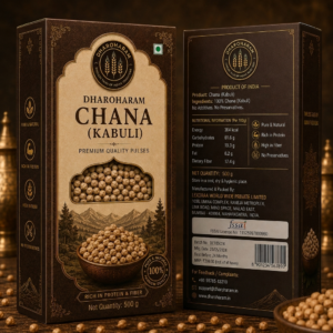
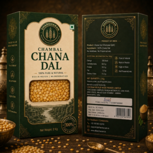
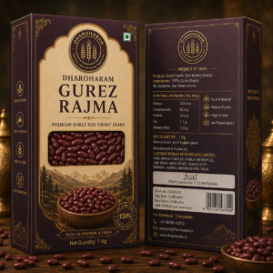
Design Elements & Branding
-
Visual Identity: The brand uses a sophisticated dark green (for pulses/grains) and a warm, vibrant yellow (for spices) as its primary color palettes.
-
Logo: A circular, gold-embossed emblem sits at the top center, featuring wheat stalks and the brand name “Dharoharam,” symbolizing the connection to the land and tradition.
-
Graphic Style: The packaging features a clean, classic, and premium look, utilizing ornate gold borders and elegant typography that conveys authenticity and high-end positioning.
-
Transparency: A central rectangular “window” showcases the actual product inside, allowing the consumer to verify the quality and color before purchase.
-
Imagery: Each pack includes high-quality, rustic illustrations of the source of the product (e.g., landscapes for grains, fresh turmeric roots), reinforcing the “Pure & Natural” claim.
-
Iconography: The left side panels include standardized icons—such as “100% Organic,” “Rich in Protein,” “High in Fibre,” “No Preservatives,” and “Handpicked Quality”—which provide quick, scannable benefits to the shopper.
Back-of-Pack Information
The back panel is structured for clarity and regulatory compliance:
-
Product Details: Lists the product name, ingredients (typically 100% pure), and a clear “No Additives/No Preservatives” disclaimer.
-
Nutritional Information: A clear table provides nutritional breakdown per 100g, making it easy for health-conscious consumers to compare products.
-
Regulatory & Logistics: Includes the FSSAI logo and license number, manufacturer details (Lexoraa World Wide Pvt. Ltd.), net weight, batch number, manufacturing date, best-before duration, and MRP.
-
Consumer Engagement: Provides a barcode for retail tracking, alongside contact information (phone, email, and website) for feedback and complaints, which builds consumer trust.
Key Features
-
Premium Positioning: The use of serif fonts and gold-toned accents elevates the product from a commodity to a premium culinary staple.
-
Clear Hierarchy: The design flows logically from the brand identity to the product name, visual proof (window), and finally, the technical/nutritional details on the back.
-
Trust Indicators: Mentions of “Premium Organic,” “Pure & Natural,” and “Handpicked Quality” are strategically placed to reassure the customer of the product’s integrity.
Reviews
There are no reviews yet.